

Introduction
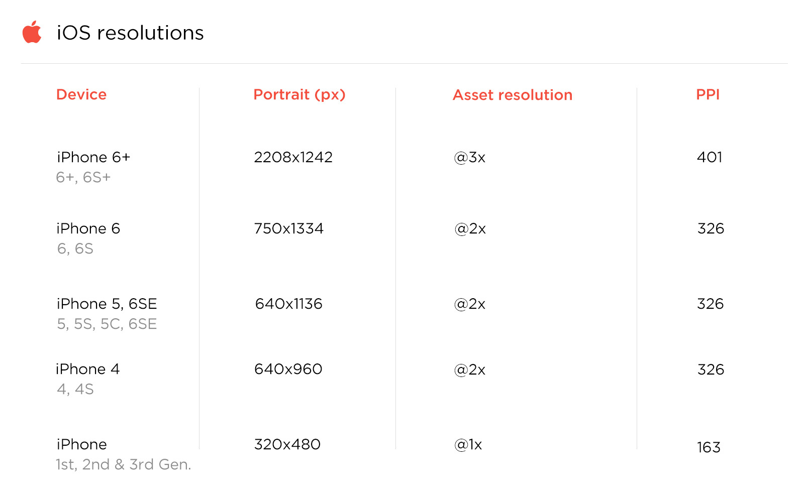
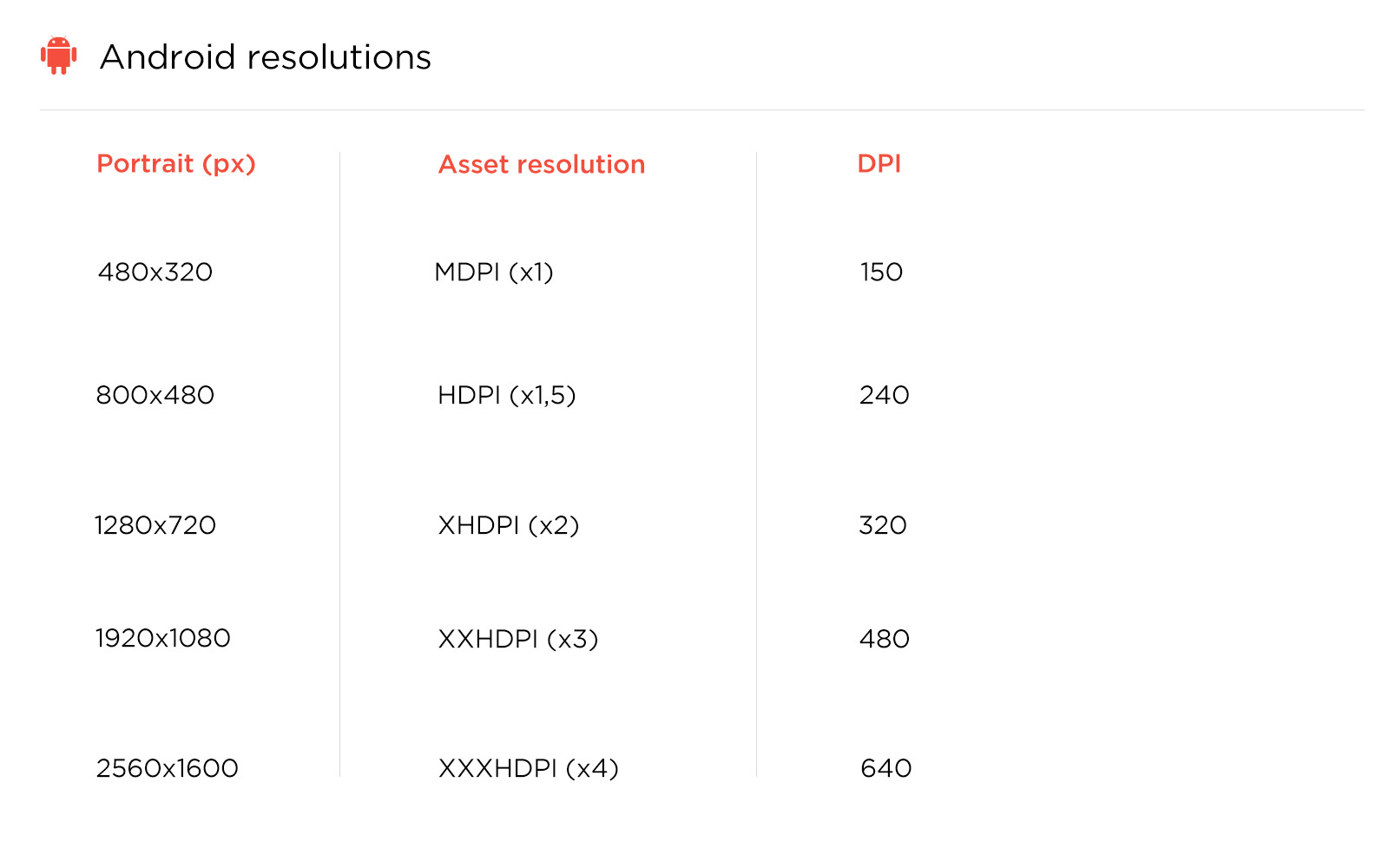
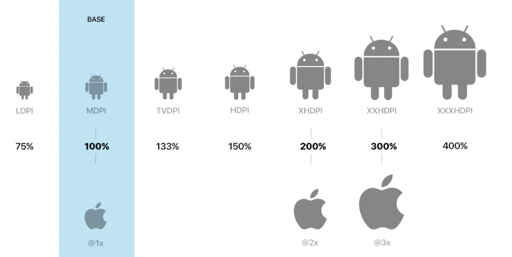
Nowadays, many designers are designing for mobile @2x for iOS screens and @3x or even @4x for Android screens (=xxhdpi). If you don’t remember the meaning of these concepts, read this short reminder about resolutions and display specifications used for both iOS and Android devices.
Why were we designing at this asset resolution?
Basically, it’s counterintuitive to design at a low and non-retina screen resolution. We are all using an iPhone 5, 6 or even 7 already for iOS and one of the latest Galaxy or Nexus smartphone as test devices for Android.
It’s obviously easier to preview your design when mockups are 1:1 with the test device you are previewing on. If you use any device that has a lower resolution than @2x or@3x, the design would appear blurry on the device.
The main problem is that Apple and other competitors continue to create new devices with different screen sizes and densities. Just have a look at https://design.google.com/devices/ to realize the multiplicity of screen sizes and resolutions.
As Designer,it is basically impossible to account for every screen type when you design. More than that, considering the fact that each platform has its own unit of measure (point, dp, px,…) it became increasingly difficult to design for each platform and translate from point to pixel of dp perfectly.
So, since it’s impossible and impractical to create one version of each design to fit for all of these screens, designers need a new solution that achieve resolution independence.
Designing @1x
1. Work faster by restoring to the 1 point = 1pixel paradigm
It’s the same story for each designer. You need to work as fast and efficient as possible, because you often don’t have the time to create your dream product. It really becomes a nightmare when considering multiple platforms at one.
Designing in 1x means 1pt is equal to 1px. What does this mean ?
Before 2010, one point always equaled one pixel. So even if OS used language disparity (measure of units) it was pretty easy to translate designs into code.
However, this beautiful reality changed when Apple introduced their retina display with high PPI (pixels per inch) screens (iPhone 6 = Hell) and a big jump in the work required to create assets has been added.
Why ? Because this new release doubled the number of pixels contained in a single point. The iPhone 6, though his pixel density that remained the same as previous models (326DPI), has a higher screen resolution than older models. So, a third set of assets is now needed to design optimally on this device, the @3x resolution.
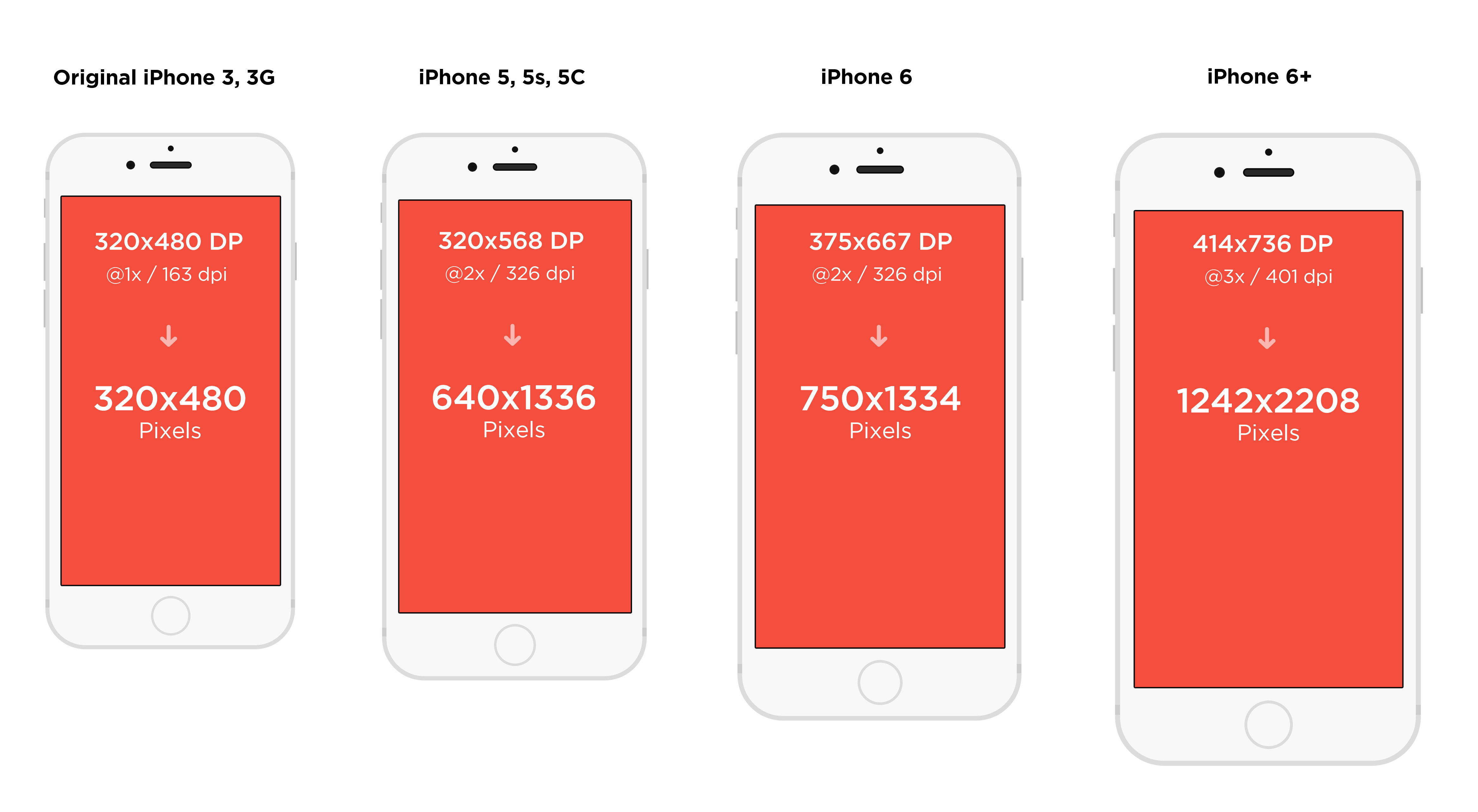
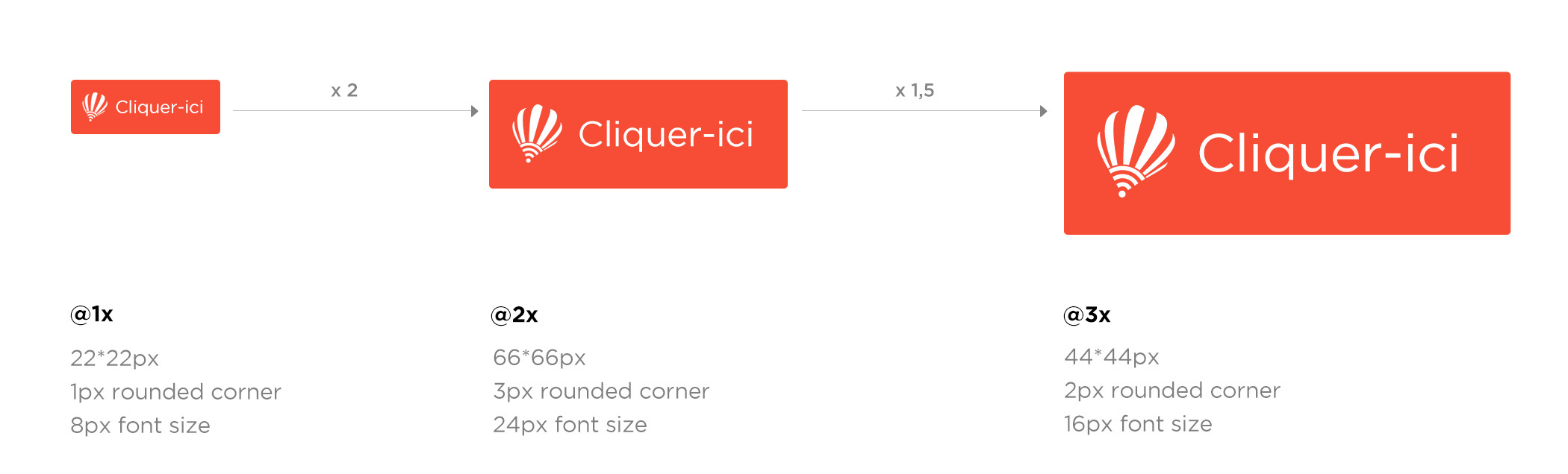
Just imagine, you start designing @2x resolution for example 640x1136px (iPhone 5). CConsidering a button that has 66 size, and font label size is 36px; and now you need to create @3X pixel density assets. So you should scale the original image to 60x60 (remember @3x = @2x * 1,5) and export it @3x.
By using 1x, you can easily convert from pixels to pts/dps. For example, 16 pixels in design-speak translate to 16 pts/dps in dev-speak.
So 1x (or MDPI), 1 px = 1 pt (iOS) = 1 dp (Android) - A-M-A-Z-I-N-G
Despite that, It also enables you to work faster because your file weight is considerably lighter (using fewer pixels = less RAM).
2. Scale up
Make pixel perfect design (No, it’s not a dream, it’s actually possible). Designing @1x means you have to scale-up your assets instead of scale-down. Scale-up simplifies the calculation process and ensure you to maintain « pixel perfection » throughout the adjustment for different displays.
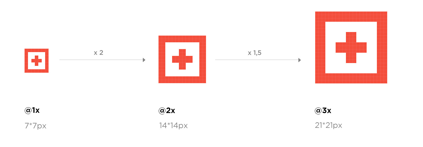
If you design at 2x or 3x instead, you’ll quickly run into mathematics when scaling your design up for @3x and down for @1x. It means you have to divide you asset by 3 to get @1x resolution and by 1,5 for @2x. You are going to say « well, it’s not as difficult as told to divide something by 1,5 or 2, it’s not difficult mathematics» but by scaling down and up pixels assets you are more likely to break the pixel grid and transform it to non-integer pixel which blur the design.

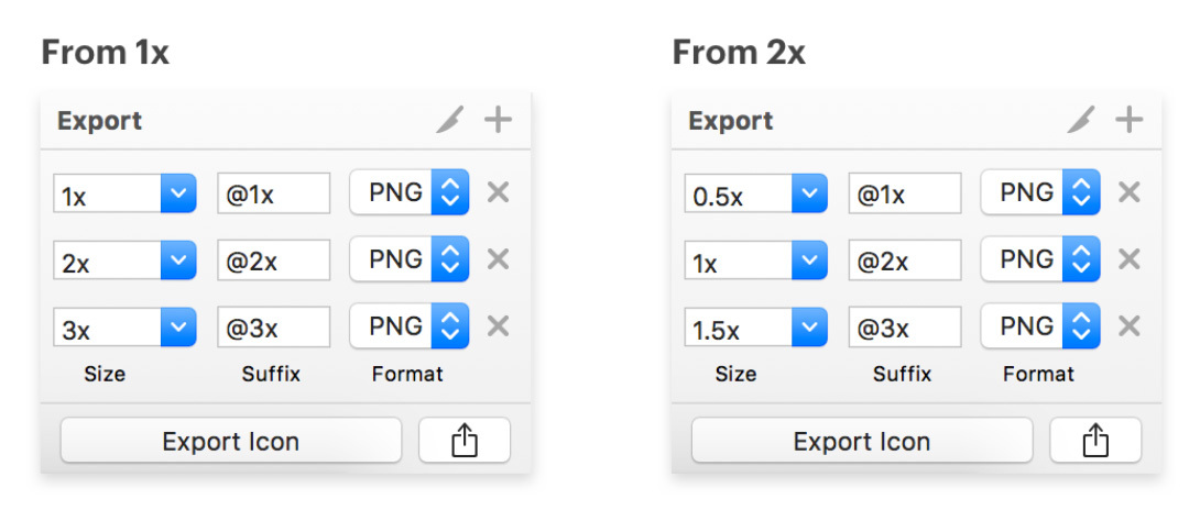
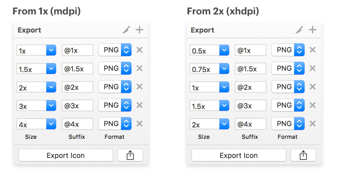
3. Export becomes easy !
Here’s a comparison between exporting from @1x and @2x for both iOS and Android.
4. Be ready for the future
Designing @1x defends you against Apple, Google and Windows new screens density for which you’d have to do new conversions.
5. Avoid the placebo space effect
Designing @2x for larger devices is quite appealing visually cause it gives you the impression that you have « more space ». The problem is that you are more likely to do mistakes in terms of sizes by creating too small tap targets or text for smaller devices when exporting at lower resolution. Designing @1x can help you to prevent this kind of mistakes.
6. How to prepare the switch ?
First, start by creating 1x Canvas Sizes. Our 1x canvas sizes are as follows:
- Desktop: 1440 x 900
- Web: 1440 x 900
- iOS iPhone 6: 375 x 667
- Android Nexus 5: 360 x 640
Then, choose the software of your choice and adapt the way of working
- Photoshop : Standard artboard templates in Photoshop are 2x since the default dimensions for iPhone 6 are 750x1334 px when you first create an artboard-based PSD. To switch to 1x artboards, simply change the width to 375 pixels and the height to 667 pixels.Even though the units are pixels, keep in mind that because you are designing in 1x, it is also 375x667 pts (ow yeah)
- Sketch : In contrast, when you insert an artboard in Sketch and select iPhone 6, the dimensions are 375x667 px. This is because Sketch is naturally a vector-based design tool with a default resolution setting of 1x. In fact, Sketch recently came out with awesome new features to make designing for multiple devices even easier, namely the ability to build flexible layouts with the new Sketch 39 resizing tool. Learn how to make the most of this new feature here : https://medium.com/sketch-app-sources/sketch-39-resizing-cheat-sheet-feec0450e7e2#.2wx44vjdq
Sources
- https://www.sketchapp.com/learn/
- http://sebastien-gabriel.com/designers-guide-to-dpi/
- http://ux.stackexchange.com/questions/36337/what-is-the-generally-accepted-resolution-for-mobile-design
- https://medium.com/shyp-design/design-at-1x-its-a-fact-249c5b896536#.t0sz2f8dk
- https://medium.com/sketch-app-sources/designing-at-1x-33240842180c#.zg001fkwc
- http://blog.fluidui.com/comparing-designs-flows-for-ios-and-android-apps/
- http://sebastien-gabriel.com/designers-guide-to-dpi/
- https://www.smashingmagazine.com/2015/05/retina-design-in-photoshop/
- https://www.smashingmagazine.com/2014/10/create-assets-for-multiple-scale-factors/
